
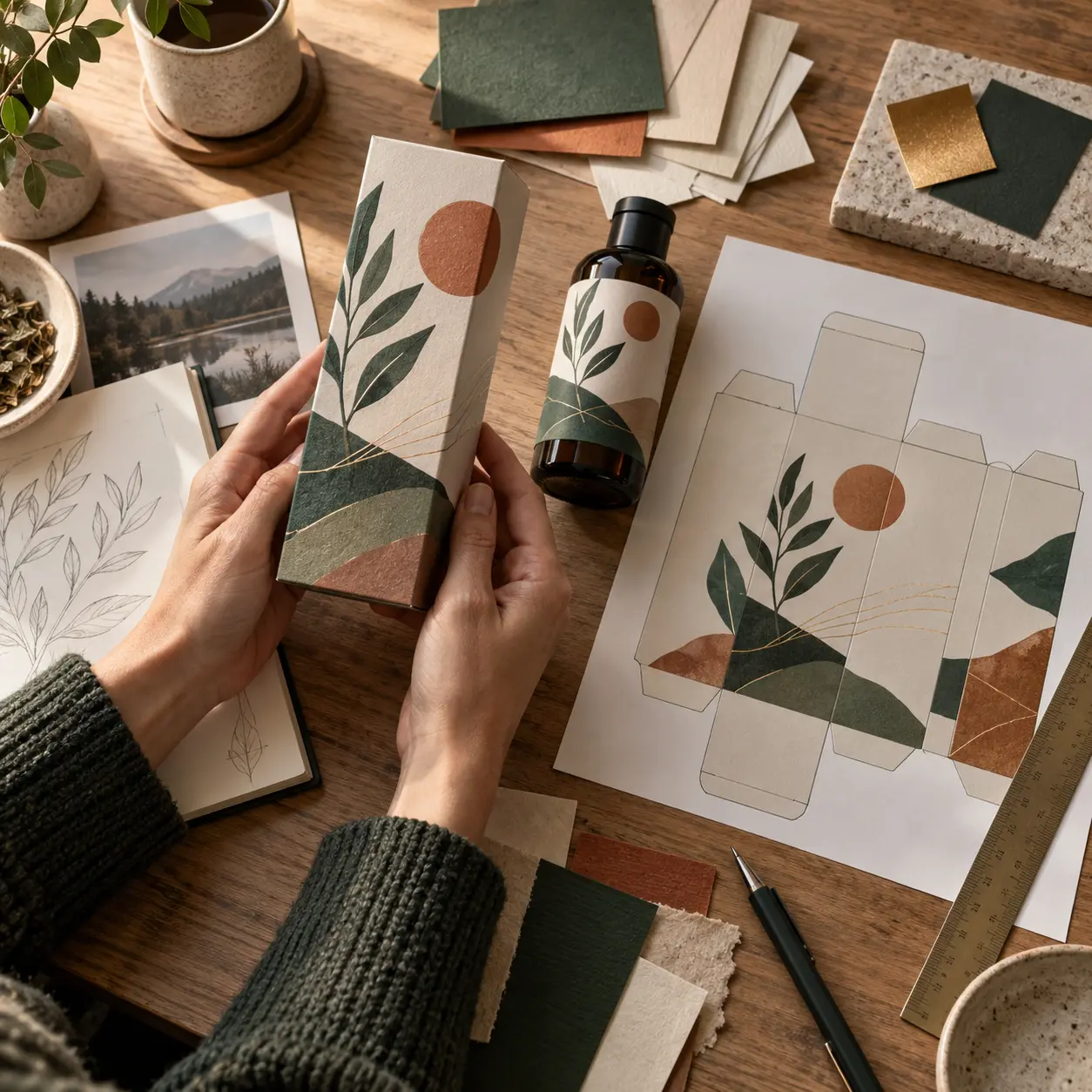
You've got a printer's quote, a minimum order quantity that made your eyes water, and an email asking for "print-ready artwork with the dieline". Product packaging design is the step nobody warned you about, and in Canada it comes with a legal panel you don't get to design freely. Get it wrong and you can't patch it later. A print run ships finished. Here's what the work involves, what it costs, and what your label has to carry.
What does product packaging design cover?
Product packaging design is the work of turning a brand identity into artwork a printer can manufacture and a regulator will accept. It covers four things: the structure, meaning the format and its dieline; the surface, meaning the artwork printed on it; the files, meaning press-ready vector art at the right colour and resolution; and the legal panel, meaning what Canadian law requires. Miss one and the run stops.
Three terms get used interchangeably and shouldn't be. Structural design is the box itself, the engineering of a format that protects a product and stacks on a pallet. Graphic or surface design is the artwork applied to it. Prepress is the technical preparation of that artwork for one specific press on one specific stock.
Three more terms you'll hear from your printer in week one:
- Dieline. The flat template showing every cut, fold and glue tab at actual size. The grid your artwork is built into.
- Mockup. A rendered image of the finished pack. Useful for approvals, useless to a printer.
- Print-ready artwork. Vector files in the correct colour space, with bleed, safe area and outlined type, built on the dieline.
If your identity isn't settled, packaging is the wrong place to work it out. That argument belongs in brand strategy versus brand identity. Close to four in five product clients arrive with a logo and no vector master file, the most common reason week one stalls.
Why your pack is doing more brand work than your website
A carton on a shelf in a Commercial Drive grocer is often the first physical encounter anyone has with your brand. It's seen at arm's length, under fluorescent light, beside eleven competitors, by someone who isn't looking for you. Your website gets a warm, seated reader. Your pack gets none of that.
According to Ipsos research conducted in 2018 for the Paper and Packaging Board, 72% of American adults said packaging design often influences their purchase decisions, rising to 81% when buying a gift. That's United States data on 2,002 adults, so treat it as directional rather than Canadian, but the direction isn't in doubt.
“you only have two seconds to wow ’em”
Diane Lindquist, writing on effective packaging design for The Dieline
Two seconds changes what good design means. Legibility at distance beats detail. One dominant visual beats five competing ones. And your logo has to survive reproduction at a size it was probably never tested at. In our studio tests, marks with fine hairlines or tight counters start falling apart below roughly 22mm on uncoated stock, smaller than most founders expect and bigger than most lip balm labels.
Packaging artwork is an output of an identity system, not a replacement for one. Our brand design service settles that layer first. Skip building a brand style guide and packaging is usually where the drift starts: SKU three gets a slightly different green because the printer's file was built from a JPEG.
The anatomy of a pack that sells and complies
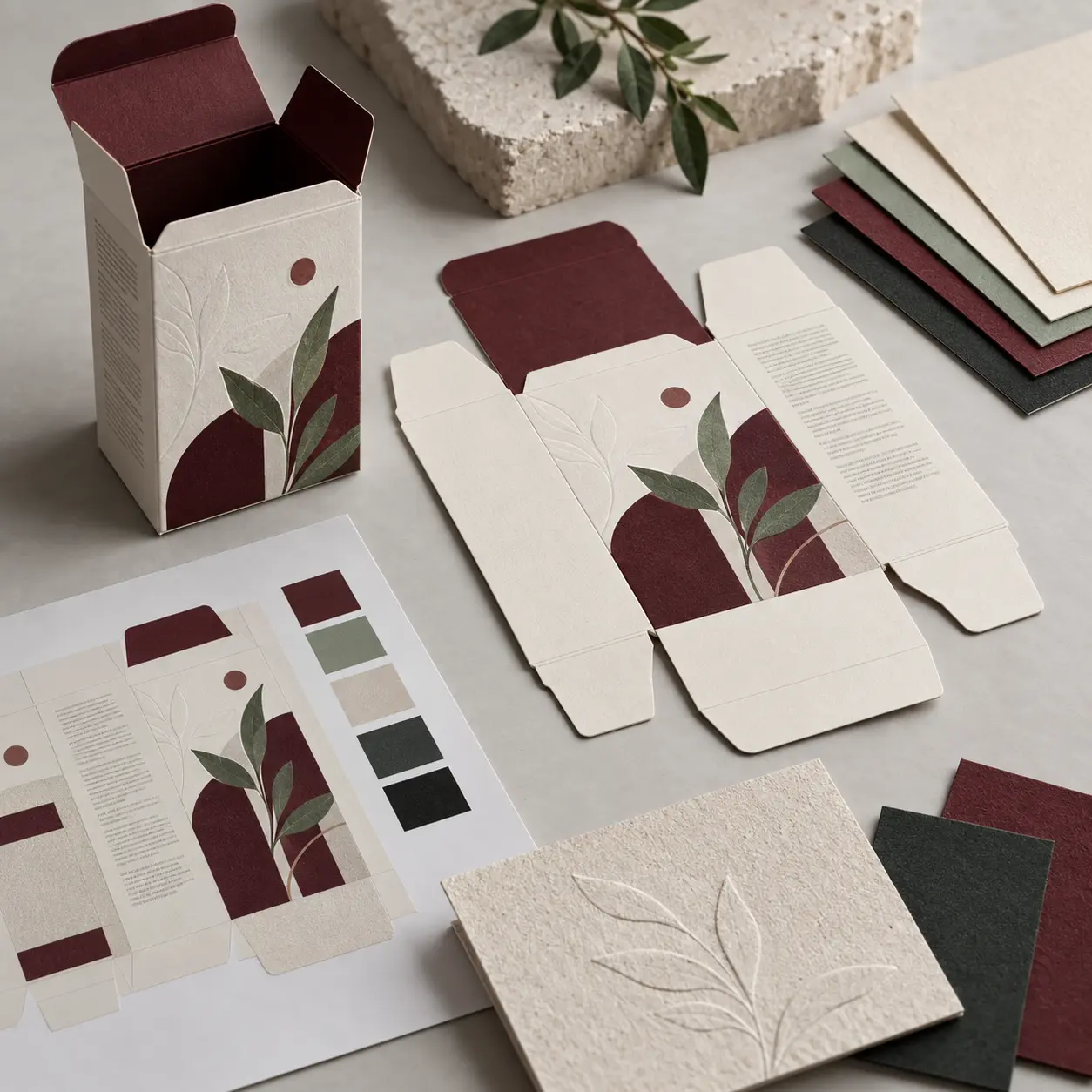
Five elements make up almost every pack we produce. In this order the project stays cheap. Out of order, you'll redraw the front panel three times.
- Structure and dieline. What it is: the physical format and the flat template the printer works from. What goes wrong: artwork designed against a mockup rather than the real dieline, so the logo lands on a fold.
- Front panel hierarchy. What it is: the three things a buyer must read in two seconds. What goes wrong: five things compete for first place and none of them wins.
- Material and finish. What it is: stock, coating and any special effects. What goes wrong: foil gets specified before anyone checks the unit cost at the quoted quantity.
- The legal panel. What it is: the mandatory information Canadian law requires. What goes wrong: it's added last and forces a redesign of everything around it.
- Press-ready files. What it is: vector artwork, correct colour, bleed, safe area, outlined type. What goes wrong: linked images at screen resolution, found by the printer at the worst moment.
The structure and the dieline
Pick the format before you draw anything. A folding carton, a rigid box, a label on a jar and a stand-up pouch are four different design problems, not four skins on the same one. Ask your printer for the dieline as a vector file at actual size and build directly into it. Never design around a mockup and reverse-engineer the dieline afterwards. That's how you discover your product name crosses a score line.
The front panel hierarchy
A buyer needs three answers in two seconds: what is it, whose is it, why this one. That's the whole hierarchy, and everything else is back panel. Type and colour behave differently on physical stock than on screen, so read choosing fonts and colours for the selection logic, then test the result printed, at size, in a shop.
Material, finish and the decisions that cost money
Uncoated stock reads as honest but colours dry back duller than your screen promised. Coated stock holds saturation and fingerprints. Matte lamination feels premium and scuffs; gloss doesn't scuff and looks cheaper. Foil and spot colours are where small brands blow the budget, because both add a press pass. Spend on stock and one well-executed special, not three half-hearted ones.
The legal panel
The real estate carrying mandatory information isn't yours to design freely, which is precisely why it gets laid out first. We place the legal panel on every SKU before the front panel is drawn. On the GlowBrew range that discipline freed up roughly a third more front-panel space than the previous approach had left. You can see the finished system in the GlowBrew identity and packaging case study.
The files your printer actually needs
Vector artwork in CMYK with any spot colours named and separated, bleed past every trim edge, a safe area nothing important crosses, type converted to outlines, and linked images at press resolution rather than whatever came off the phone. Expect two or three rounds of dieline revision before a file is genuinely press-ready.
What does Canadian label law require on your packaging?
Most articles on this subject are written for an American reader, so here's the Canadian answer plainly. For prepackaged non-food consumer products, the Competition Bureau requires three things on the label: a product identity declaration, the net quantity, and the dealer name and place of business. All three go on the principal display panel, the part a shopper sees on the shelf.
Does packaging have to be bilingual in Canada? For products covered by the Consumer Packaging and Labelling Act, mandatory label information has to appear in both English and French, with the dealer's name and address as the usual exception. That's not a design preference. It drives layout, because two languages need roughly twice the panel space, and deciding it in week one is far cheaper than discovering it in week six.
Scope catches people out. Food, drugs and medical devices are exempt from this Act and fall under other rules. Food and beverage brands answer to the Canadian Food Inspection Agency; cosmetics and natural health products answer to Health Canada. Pet food, usefully, is not exempt.
The consequences aren't theoretical. The Competition Bureau notes that anyone convicted of contravening the Act is liable to a fine of up to $5,000 on summary conviction, or up to $10,000 on indictment, and that non-compliance can also engage the deceptive marketing provisions of the Competition Act.
One line that isn't optional: this is orientation for designers, not legal advice. Your brand is responsible for compliance, and should confirm current requirements with the Competition Bureau, or the Canadian Food Inspection Agency for food, before going to press. We don't quote minimum type heights or panel percentages here, because those change and a wrong number would cost you a run.
Print design beyond the pack: the pieces that travel with the product
The pack is the centrepiece, but it's rarely the only printed thing a product brand needs. Each of these attaches to a moment in the customer journey, and each is cheap compared to the pack itself.
- Shipping inserts and mailer cards. The unboxing moment for direct orders. A thank-you card with a reorder code beats a second colour on the carton, and matters most if you're selling through your own store rather than a marketplace that controls the box.
- Hang tags and belly bands. Where a story goes that won't fit on the pack, and the cheapest way to differentiate a variant.
- Stickers and tamper seals. A generic carton plus a printed seal lets you run four flavours on one die.
- Shelf talkers and market signage. The farmers market table and the grocer's shelf edge, usually the highest-return print a young brand buys.
- Business cards for wholesale buyers. A buyer takes a card, not a carton.
All of it lives or dies on whether your logo files behave at each size and in each finish. We won't rebuild that here, because a logo that works at every size covers file types and reproduction from favicon to signage in full. If you're still deciding whether the mark is strong enough to carry a shelf, what makes a logo memorable is the companion piece. And brands selling direct want the pack and the product page telling the same story, which is a job for ecommerce web design rather than a printer.
What does packaging and print design cost in Canada?
Design fees and print run costs are two different budgets, and conflating them is the single most common founder mistake we see. The designer doesn't set your minimum order quantity. The printer does.
| Design fee | Print run cost |
|---|---|
| Paid once per artwork set, before manufacturing | Paid per run, every time you reorder |
| Driven by SKUs, languages and whether a dieline exists | Driven by quantity, stock, colours and finishes |
| Reusable across reorders at no further cost | Subject to minimum order quantities |
| Rises if the identity is invented alongside the pack | Falls sharply per unit as quantity rises |
For a Canadian brand with a settled identity and a supplied dieline, our packaging artwork has generally landed between roughly $2,400 and $9,500 for a two to four SKU range, the top of that band involving bilingual layouts and a special finish. What moves it: SKU count, whether a dieline exists, how many languages, whether foil or spot colour is in play, and whether we're building the identity at the same time. If it's from scratch, what logo design costs in Canada is the number to add.
Working with a studio: files, printers and timelines
Send four things at the start and you'll save a fortnight: your logo as vector, the printer's dieline, your mandatory label information drafted and translated, and a stock sample if one exists. Roughly half the brands who come to us have already chosen a printer, which is the easier direction, because the dieline arrives with the brief.
On who talks to the printer: we do. Colour queries and file format arguments resolve faster when the person who built the file answers them. Ask for a press proof, not only a PDF proof. A PDF shows the layout; a press proof shows what the ink does on your stock, which is the thing you can't predict.
Budget six to nine weeks from brief to print-ready files, longer if translation or regulatory review is in the loop. The bottleneck is almost never the design. It's approvals.
| What the brand supplies | What the studio supplies |
|---|---|
| Vector logo and brand assets | Front panel and surface design |
| Printer contact and dieline file | Artwork built into the dieline |
| Mandatory label copy, both languages | Legal panel layout and hierarchy |
| Product photography or samples | Colour and spot colour separation |
| Sign-off and regulatory confirmation | Press-ready files and printer liaison |
If print and packaging artwork is the piece you want handed over rather than learned, that's what our graphic design service is for.
Frequently Asked Questions
What are the different types of product packaging design?
Packaging is usually grouped into three layers. Primary packaging touches the product, such as a jar, pouch or bottle. Secondary packaging holds the primary unit and carries most of the branding, such as a folding carton. Tertiary packaging is the shipping and distribution layer, such as a corrugated case or mailer.
What are the 7 basic steps to packaging design?
There's no single official list, but most studios run a similar sequence: brief, format and dieline selection, mandatory label information, front panel hierarchy, surface design and material choice, press-ready files, and a press proof. Laying out the legal panel early rather than late is what keeps the rest cheap.
What is a dieline in packaging design?
A dieline is the flat, actual-size vector template showing every cut, fold, score and glue tab for a specific pack. Your printer supplies it, and your artwork is built directly into it. It's not the same thing as a mockup, which is a rendered image of the finished pack and can't be printed from.
Does packaging have to be bilingual in Canada?
For prepackaged consumer products covered by the Consumer Packaging and Labelling Act, mandatory label information generally has to appear in both English and French, with the dealer's name and address as the usual exception. Food, drugs and medical devices fall under separate regimes. Confirm your product's requirements with the Competition Bureau, or the CFIA for food, before printing.
How much does product packaging design cost in Canada?
Design fees for a small Canadian brand with a settled identity typically run in the low thousands for a handful of SKUs, rising with SKU count, bilingual layouts and special finishes. That's separate from the print run, which your printer quotes based on quantity, stock and colours.
Five elements carry a pack: the structure and its dieline, the front panel hierarchy, the material and finish, the legal panel, and the press-ready files. Lay the legal panel out first, because it's the constraint you can't negotiate with, and build the artwork into the real dieline rather than around a mockup, because a fold doesn't care where your logo wanted to sit. Everything else is craft, and craft is the part you can brief.
Parabolic Studio builds brand identities for Canadian product brands and prepares the print-ready artwork that comes out of them. Got a manufacturer quote and a launch date? We can work to it.