
Start a project
Most small business owners choose brand fonts and colours the same way they pick paint for the living room: based on personal taste. The problem is that brand visual choices have a measurable effect on whether a customer trusts a business, hires it, or scrolls past it within three seconds.
This guide walks through how to make those choices the way a designer would, by starting with what your business needs to communicate and working backward to specific fonts and colours. If you are serious about small business branding that actually drives leads and revenue, the framework below is where to start.
Brand visuals are not a decoration layer applied at the end of building a business. They run ahead of every other marketing asset you produce. A customer reads your colours and fonts before they read your headline, and they form an opinion about your business before they finish processing the words on the page.
Brand visuals do three jobs for a small business, and none of them are about looking pretty.
First, they communicate positioning instantly. Premium or accessible. Traditional or modern. Technical or human. A potential customer reads these signals from your colour and typography long before they read what you actually do. A law firm using a playful, cartoon-style font will lose serious clients before the homepage finishes loading, regardless of how good the lawyers are. A children's daycare using a cold, corporate sans-serif will feel sterile to the parents it is trying to attract. The visual language has to match the work.
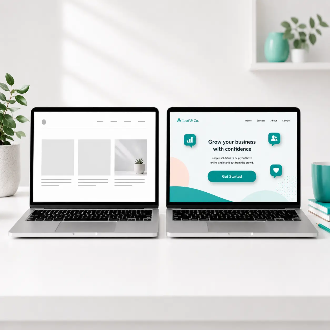
Second, they build recognition over time. Consistent use of the same colours and the same fonts across every customer touchpoint trains the market to recognise your business at a glance. This is what makes a brand feel established. It is also what makes inconsistent branding so damaging: every time the colours shift or the font changes, you are starting recognition from zero.
Third, they signal trust before a single word is read. Cohesive, considered design tells a visitor that the business behind it pays attention to detail. Sloppy, inconsistent visuals do the opposite, and most customers will not consciously articulate the reason they did not trust the website. They will simply leave.
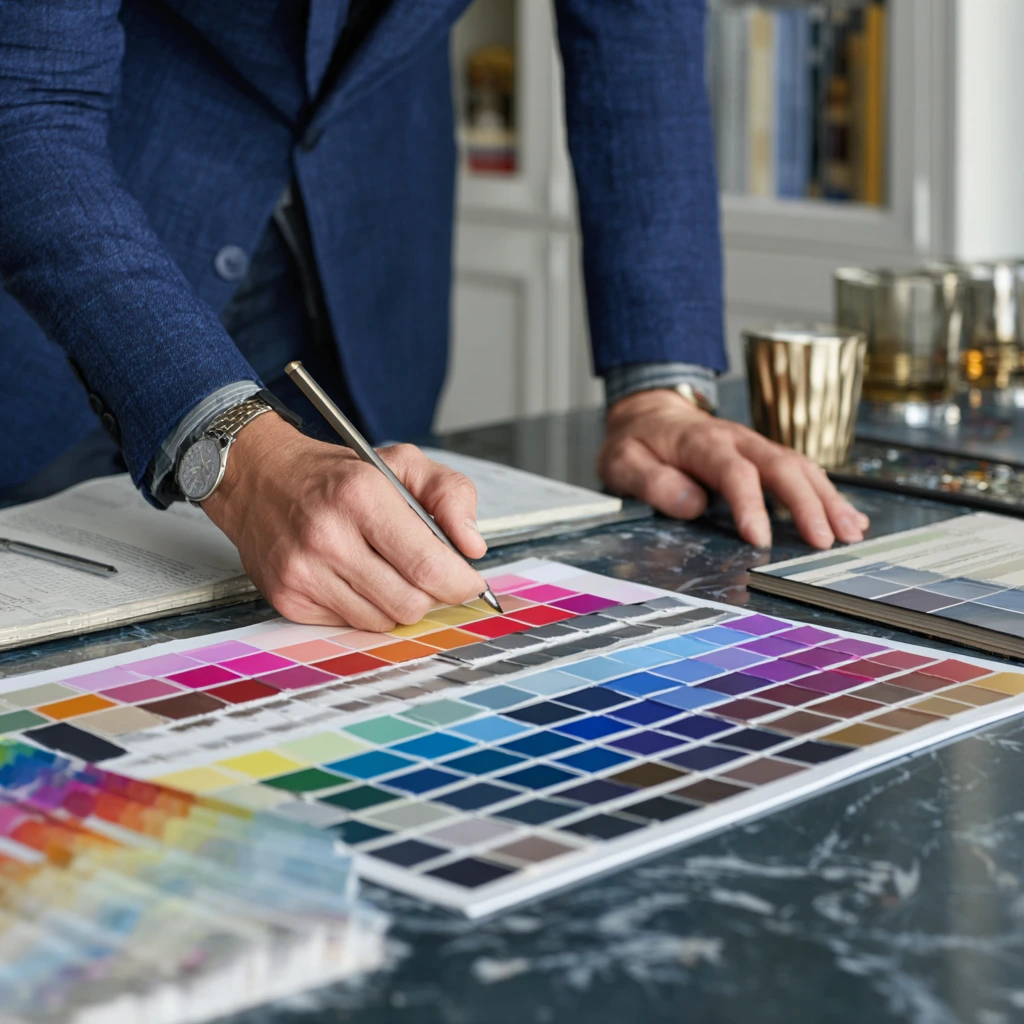
Choosing brand colours is not about finding shades you like. It is about finding shades that do a specific job for your business. Here is the process a designer would walk through.
The patterns below show up repeatedly in DIY brand work, and they all undermine conversion in measurable ways.
Font selection follows a similar logic to colour. Start with what the business needs to say, then narrow to a typeface that says it. Three questions get you there.
Two fonts maximum. One for headlines, one for body text. That is the right answer for almost every small business brand.
A single well-chosen font family with multiple weights (regular, medium, bold, plus an italic or two) can often do the entire job on its own. Modern typefaces like Inter, Manrope, and Source Sans are designed as full systems precisely so a brand can use one family across every context. Adding a second font should only happen when there is a real reason: usually a serif headline paired with a sans-serif body, to create contrast between editorial-feeling titles and clean, readable copy.
The principle to remember when pairing two fonts is contrast in style, harmony in proportion. The two fonts should feel different enough that they clearly play different roles, but their letter shapes and proportions should still belong on the same page. Three or more fonts almost always reads as chaotic.
To make this concrete, here is how a generic small business example would actually move through the process. Picture a Vancouver-based independent financial planner serving young professionals who feel that traditional firms are intimidating and impersonal.
Three adjectives: trustworthy, modern, human. The brand has to feel as competent as a big firm but warmer and more accessible than the navy-and-grey default the category runs on.
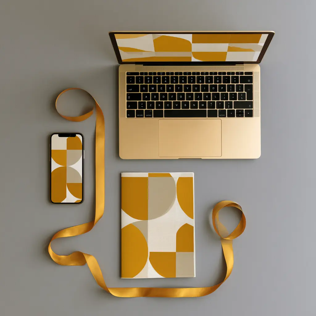
A deep teal (#1F4F4F) as the primary. It carries the trust associations of blue without being another generic finance navy, and the green undertone signals growth without leaning into the wellness category.
A warm coral accent (#E07856) for calls to action and emphasis, providing energy and warmth against the deep teal. A warm cream neutral (#F4EDE0) for backgrounds and large surfaces, which softens the overall feel. A near-black charcoal (#1F2326) for body text, easier on the eye than pure black.
Playfair Display for headlines, which reads as editorial and considered, signalling expertise without feeling stuffy. Inter for body copy, which is clean, highly readable on screens, free on Google Fonts, and works across the firm's website, client emails, and slide decks without needing to substitute Arial.
The result is a brand that reads as confidently expert (the deep teal and serif headlines) while being clearly more human and contemporary (the coral accent, cream backgrounds, modern sans body) than the generic competitor it is trying to pull clients away from. Every choice traces back to the positioning. None of them came from personal preference. You can see this kind of strategic process applied to client work in our case studies, including the brand systems for DreamForge AI and Forma Studio.
DIY brand decisions are genuinely workable in three situations: a very early-stage business with no marketing budget, a sole-operator service business that does not yet have a website or printed materials, or a testing-stage product that may not exist in twelve months. In those cases, picking a competent Google Font and a sensible four-colour palette using the framework above is enough to operate professionally.
A designer becomes worth the investment when one of three things is true. The business has paying customers and is starting to spend on marketing, which means inconsistent branding is now actively costing money. The founder is regularly sending the brand to clients, partners, or investors, where a polished identity directly affects close rates. Or the founder has tried twice and dislikes the result, which usually signals that the missing piece is the strategic foundation, not the design execution.
If any of those apply, a full small business branding package typically pays for itself within the first year through stronger conversion, faster recognition, and the reduced cost of not redoing the work in eighteen months. For businesses building a brand alongside a website, our affordable web design service in Vancouver integrates the visual identity into the site from the first wireframe.
The brands that convert are not the prettiest ones. They are the ones where every visual choice can be traced back to a clear answer about what the business is, who it is for, and how it should feel.
Parabolic Studio builds brand identities for small businesses and startups across Metro Vancouver. We start every project the same way, with positioning first and visuals second, because brand decisions made for the right reasons last longer and convert better. If you are ready to move past a Canva logo and a template font, we should talk.
See our brand work Start a brand project