

Start a project

Stratos Lux approached us to resolve declining relevance in a competitive market. We were tasked to uncover the underlying causes through research, then redefine the brand from the inside out. The goal was to build a modern and enduring identity system that reflects luxury, trust, and innovation, setting a new benchmark for private aviation brands.
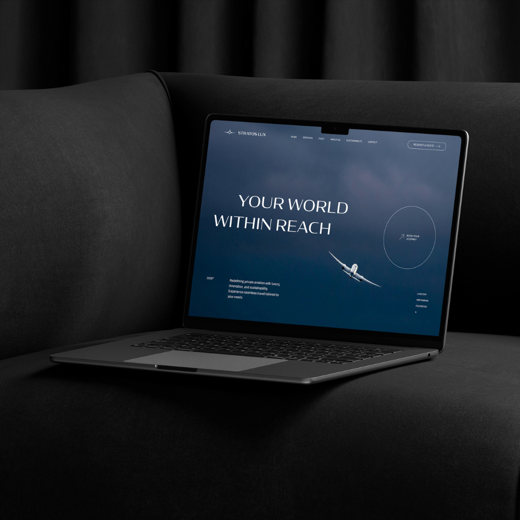
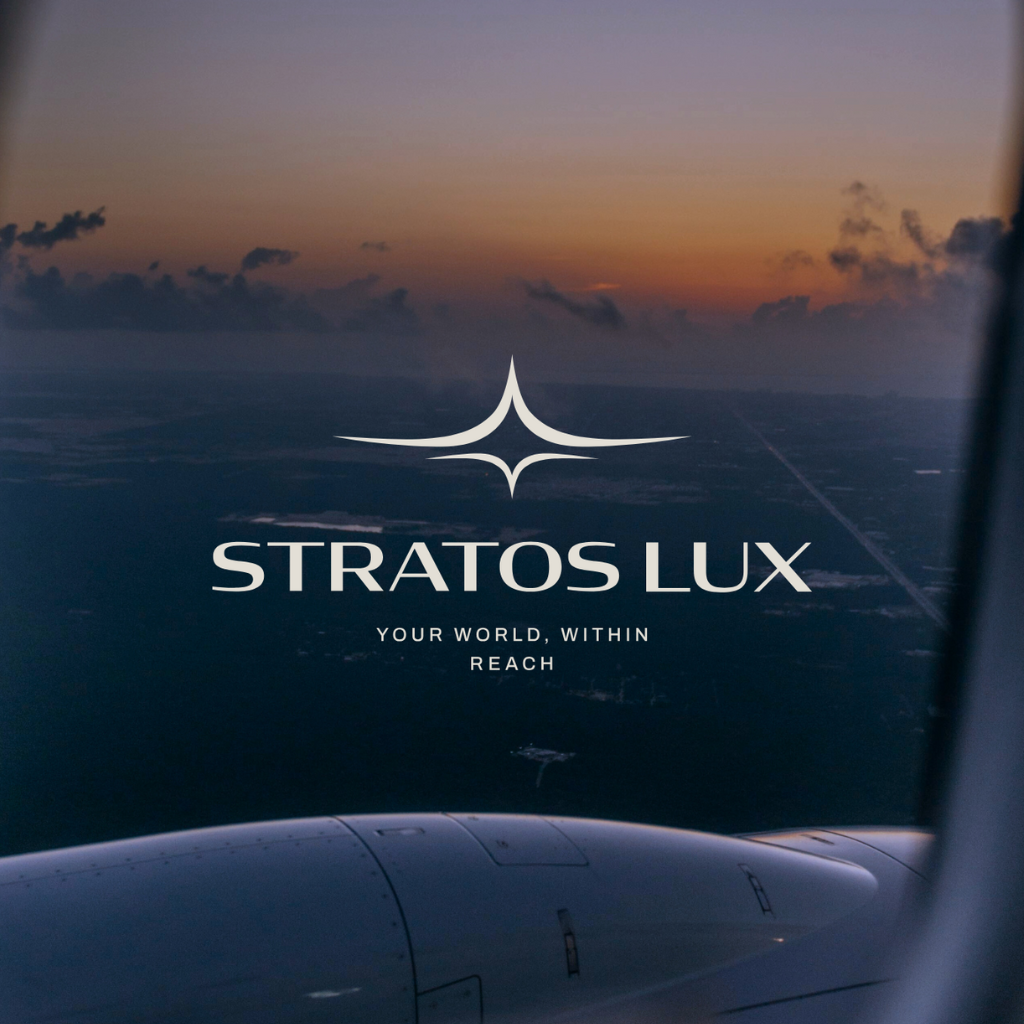
We began with a research phase that involved interviews and surveys to understand how the brand was perceived. Findings showed that Stratos Lux was seen as reputable but outdated. Using these insights, we developed a logo that unites motion and refinement through subtle geometry inspired by the curvature of flight. The palette combines deep blue, pearl white, and warm metallic tones to communicate prestige and confidence. Typography blends authority with sophistication, maintaining precision without excess. Every touchpoint, from print materials to digital presence, reinforces a consistent visual language that feels timeless and intelligent.
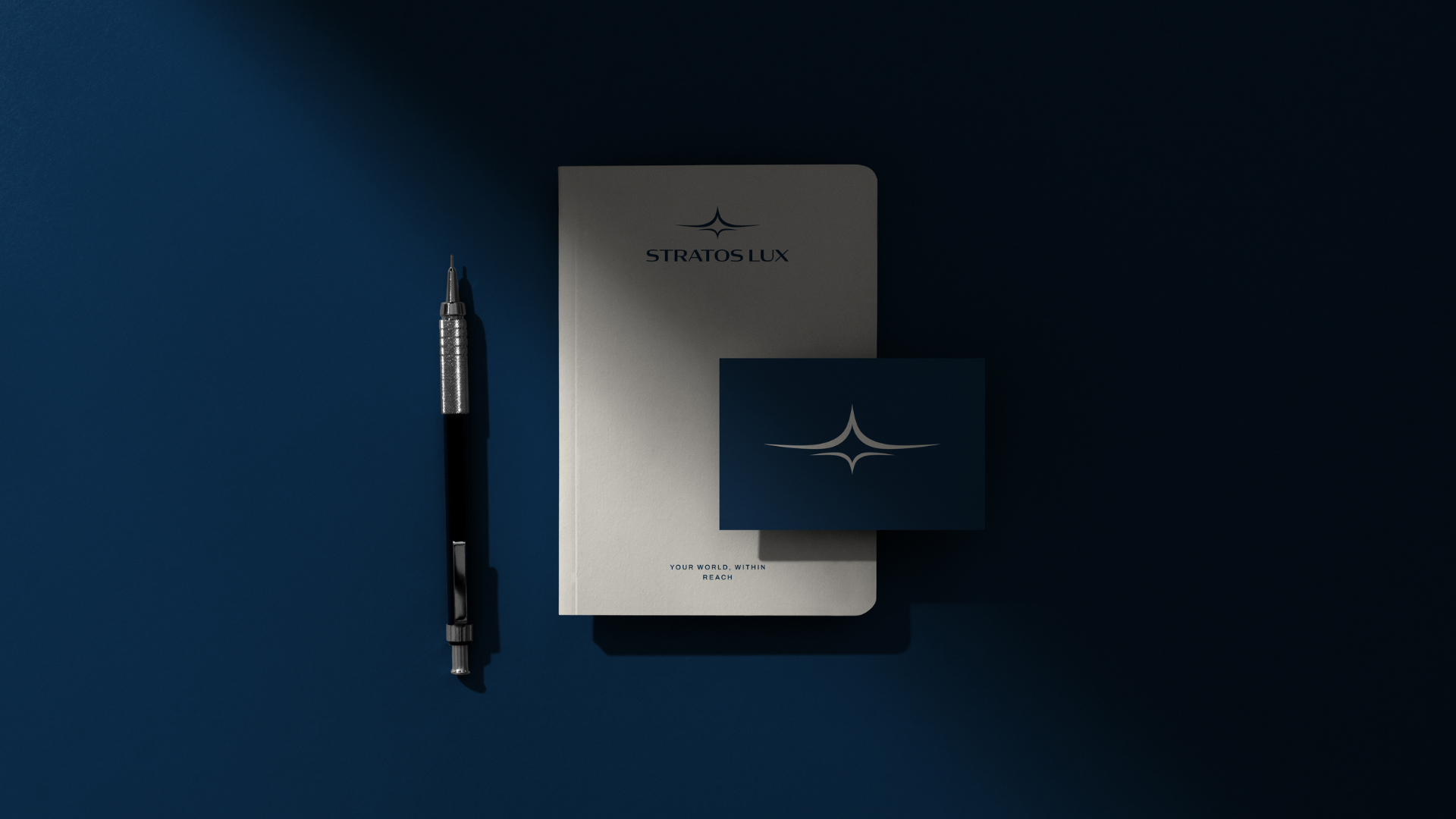

Stratos Lux now embodies the excellence and modernity its clientele expects. The new brand feels cohesive, elevated, and confident. It restores the company’s position among the upper tier of luxury aviation while opening the door to a younger, forward thinking audience that values authenticity and design precision.

.png)
.png)
.png)
.png)