Color Chemistry #1: Meet Caper and Three Ways to Style It

Rébecca Doreen
Rébecca Doreen
July 16, 2025
Branding
Web Design

Welcome to the very first post in our Color Chemistry series!

Each week, we explore one standout color and mix it up with a few unexpected pairings. No color theory lectures, just fresh palettes and visual inspiration to get your ideas flowing.

This week’s focus is on Caper, a soft, leafy green that feels calm, grounded, and a little bit charming.

Let’s see how it transforms when paired with three very different moods.

1. Caper and Cornflower

A calming color pairing featuring a soft green called Caper (#A6CB91) and a sky blue called Cornflower (#C4DBF3). The layout includes typography color suggestions in navy blue (#3A6497), black, and white, designed to convey an open, relaxed, and airy mood.

Feeling: Light, breezy, and open

Hex Codes: # A6CB91 and # C4DBF3

This combo feels like a breath of fresh air. Caper’s mellow green meets a delicate sky blue for a palette that’s light, clean, and serene. It has the kind of presence that feels quiet without being boring.

Use it when you want a layout to feel spacious or calming. Great for wellness brands, lifestyle sites, or anything that needs to take a gentler tone.

Try it with:

  • Soft navy text (#3A6497) to keep things structured
  • White or black for contrast
  • An airy sans-serif font to complement the palette

2. Caper and Medium Wood

An earthy palette combining Caper green (#A6CB91) with a warm brown called Medium Wood (#AA8562). Suggested typography colors include black and white, reinforcing a grounded and natural aesthetic ideal for eco-conscious themes.

Feeling: Warm, earthy, and grounded

Hex Codes: # A6CB91 and # AA8562

This one leans into natural tones. The warm brown brings depth, while Caper keeps the palette feeling fresh and organic. Together, they give off a sense of trust and simplicity.

Perfect for sustainable brands, packaging for handmade goods, or any project that benefits from an honest, tactile feel.

Try it with:

  • Neutral or black typography for contrast
  • A serif font with a bit of texture to add a handcrafted quality

3. Caper and Lemon

A playful and energetic color pairing using Caper green (#A6CB91) with a bright lemon yellow (#FFF360). The palette is supported by minimal typography colors in black and white, designed to create a fresh, youthful tone with just a pop of brightness.

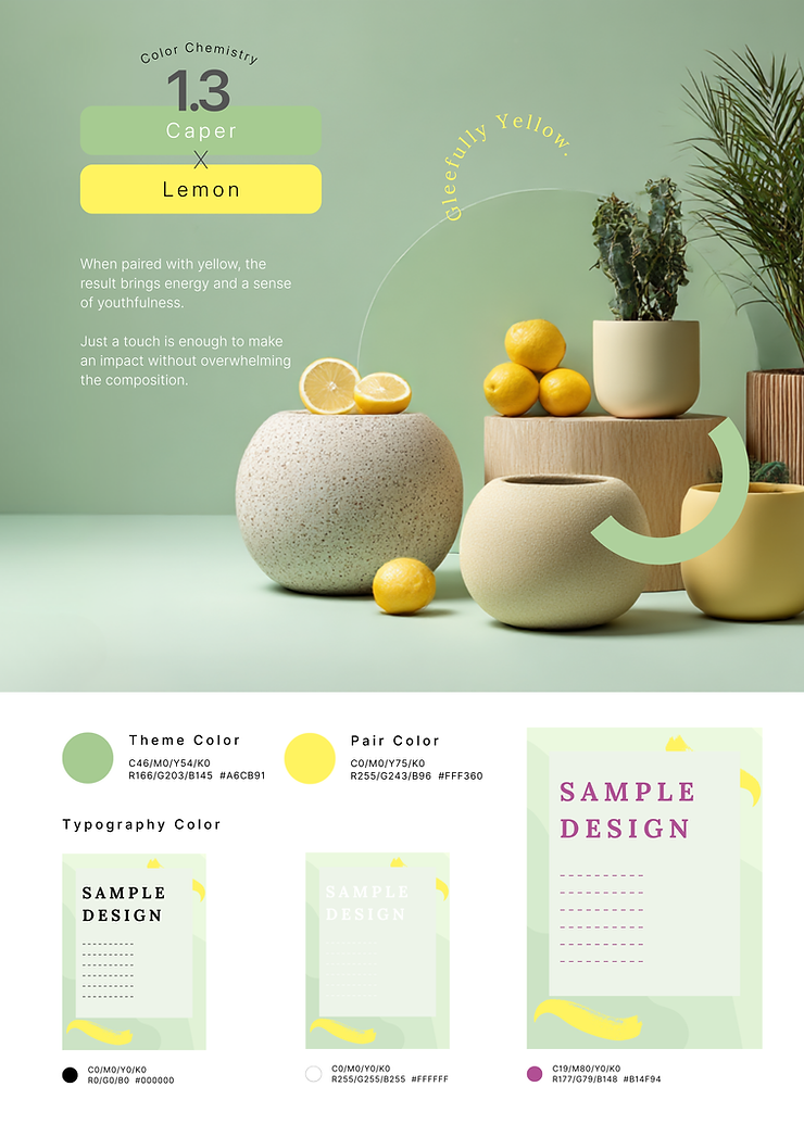
Feeling: Bright, playful, and energetic

Hex Codes: # A6CB91 and # FFF360

Here’s where Caper gets a little fun. Lemon yellow brings just the right amount of boldness to lift the green without overpowering it. A small pop goes a long way.

This pairing works well for youth-driven branding, seasonal promos, or moments where you want to feel fresh and full of life.

Try it with:

  • Minimal black or white text
  • Clean, simple layouts that let the color do the talking

Final Thoughts

Caper may be subtle on its own, but it has range. Depending on what you pair it with, it can feel calm, earthy, or full of energy. That’s the fun of color chemistry. Tiny shifts can create entirely new moods.

New palettes drop weekly. Follow along and start building your own collection of go-to combinations.

Latest from the journal
Color Chemistry #1: Meet Caper and Three Ways to Style It
Explore three ways to style the soft green “Caper” with Cornflower, Medium Wood, and Lemon to shift visual tone and mood in design.
Continue Reading
Color Chemistry #2: Meet Pale Teal and Three Ways to Style It
Explore three ways to style Pale Teal paired with Moon White, Dark Vanilla, and Chantilly to shift mood and visual tone in brand design.
Continue Reading
What to Expect When Hiring a Web Design Studio: A Small Business Guide
Learn what small businesses should expect from a web design studio including process, pricing, and ongoing support after launch.
Continue Reading

Discover just how far we can take your

website

brand

graphics

website

Ready to create something remarkable? Let's connect and discuss your next project.
Start a project